Introduction
As I continue my transition into the tech industry, I’ve been exploring valuable AWS services that demonstrate cloud proficiency. One particularly useful tool is AWS QuickSight, Amazon’s cloud-native business intelligence service that enables you to create and publish interactive dashboards with just a few clicks—no server management required.
In this blog post, I’ll share my experience implementing a data visualization project using AWS QuickSight. I used a Netflix dataset to create engaging visualizations that showcase content trends and patterns—demonstrating how QuickSight can transform raw data into actionable insights.
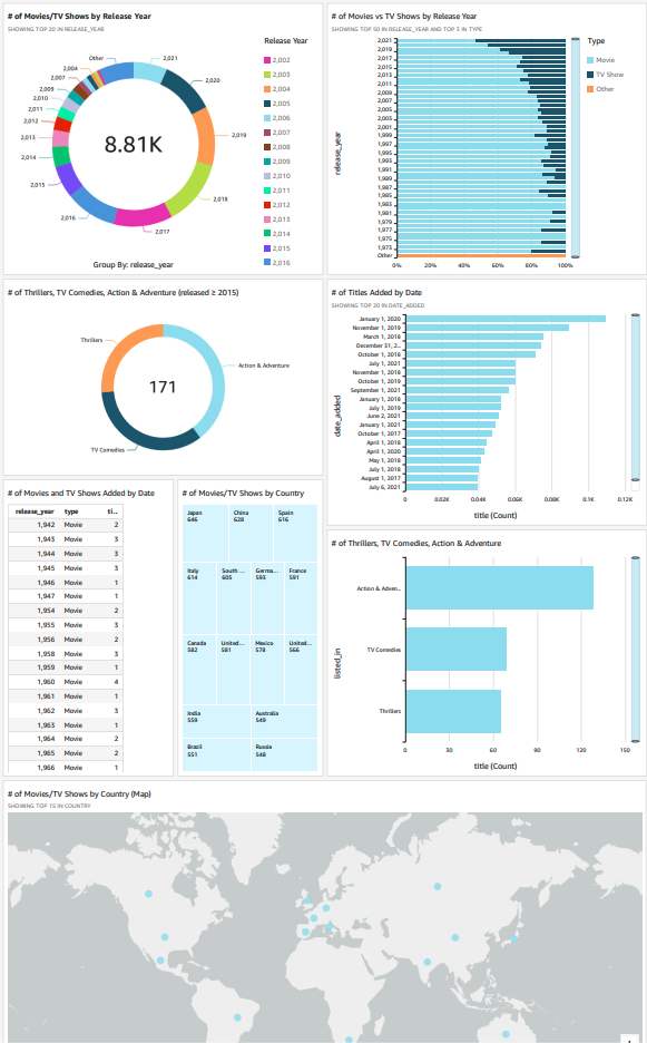
Project Overview
Time Investment: Approximately 3 hours (including setup, data preparation, and visualization creation)
AWS Services Used:
- Amazon QuickSight
- Amazon S3
Key Concepts Learned:
- Data preparation and transformation
- Manifest file configuration
- Interactive dashboard creation
- Visual analysis techniques
- Data refresh procedures
Why Choose QuickSight for Data Visualization?
Before diving into the implementation steps, here’s why QuickSight stands out for data visualization projects:
- Cloud-Native Integration: Seamlessly connects with other AWS services like S3, Redshift, and Athena
- Serverless Architecture: No infrastructure to manage, allowing you to focus on analysis
- Cost-Effective: Pay only for what you use with per-session pricing options
- Highly Scalable: Handles datasets of any size without performance concerns
- Machine Learning Capabilities: Includes ML-powered insights and anomaly detection
Step 1: Preparing and Storing the Dataset
The foundation of any good visualization is properly prepared data. For this project, I used the following process:
- Selected a Netflix dataset (netflix_titles.csv) containing information about movies and TV shows
- Created an S3 bucket to store the dataset
- Created a manifest.json file that defines the dataset structure
- Uploaded both files to the S3 bucket
The manifest.json file is particularly important, as it tells QuickSight how to interpret your data:
{
  "fileLocations": [
    {
      "URIPrefixes": [
        "s3://your-bucket-name/"
      ]
    }
  ],
  "globalUploadSettings": {
    "format": "CSV",
    "delimiter": ",",
    "textqualifier": "\"",
    "containsHeader": "true"
  }
}
Pro Tip: When working with complex data structures like JSON logs or nested data, your manifest file might need more detailed configurations to handle multi-level information correctly.
Step 2: Setting Up QuickSight Account
Next, I needed to set up QuickSight and connect it to my data:
- Navigated to QuickSight in the AWS Management Console
- Created a new account with the 30-day free trial
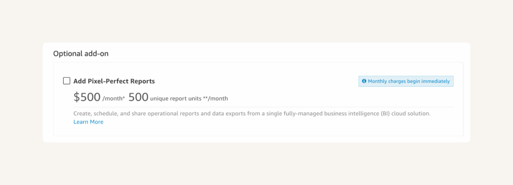
- Unchecked the “Add Pixel-Perfect Reports” add-on to avoid charges
- Selected Enterprise edition for advanced features
- Configured appropriate permissions for QuickSight to access my S3 bucket
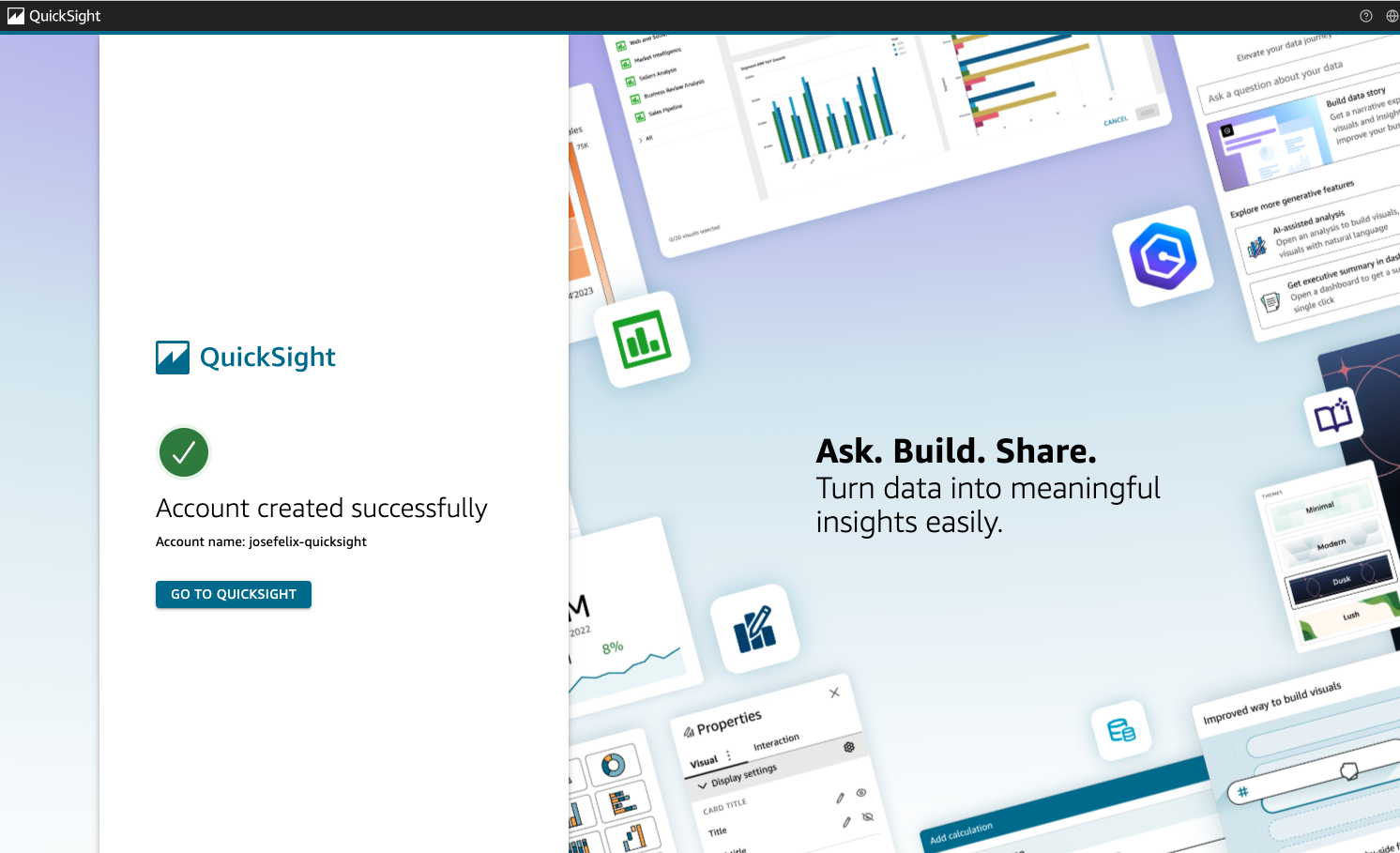
This process took less than 5 minutes, but the permissions configuration is crucial—QuickSight needs explicit permission to access the data sources you intend to use.
🚨 IMPORTANT STEP 🚨
Make sure you uncheck this offer to upgrade.
Step 3: Connecting to Data Source
Once QuickSight was configured, I connected it to my dataset:
- Clicked “New analysis” in the QuickSight dashboard
- Selected “New dataset”
- Chose Amazon S3 as the data source
- Selected “Upload a manifest file” option
- Uploaded the manifest.json file I had prepared
- Named the dataset “Netflix Titles”
- Clicked “Create data source”

QuickSight automatically analyzed the dataset schema and provided options to modify field names and data types. This feature saves significant time when working with complex datasets by automatically detecting data types and relationships.
Step 4: Creating Impactful Visualizations
With the data connected, I created several visualizations to analyze the Netflix content:
Visualization 1: Content Distribution by Year
I created a horizontal bar chart showing the number of movies and TV shows released each year:
- Selected “release_year” as the X-axis
- Set “Count” as the Y-axis
- Added “type” as a color dimension to distinguish between movies and TV shows
- Added a title “Content Distribution by Release Year”
- Applied a filter to focus on recent years (2011-2021)
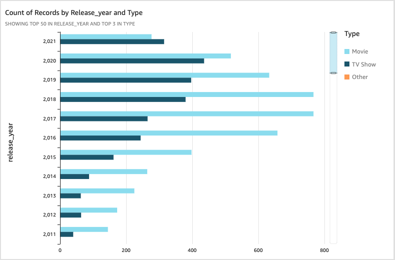
This visualization immediately revealed that 2018 had the highest number of content releases, and there was a significant increase in TV show production starting in 2011—insights that would be difficult to spot in raw data.
Visualization 2: Content by Category
For the second visualization, I created a horizontal chart showing the distribution of content across different categories:
- Selected “listed_in” for categories (removing duplicates)
- Applied filters to focus on major categories
- Added interactive legends to filter the data
- Set a title “Content Distribution by Category”
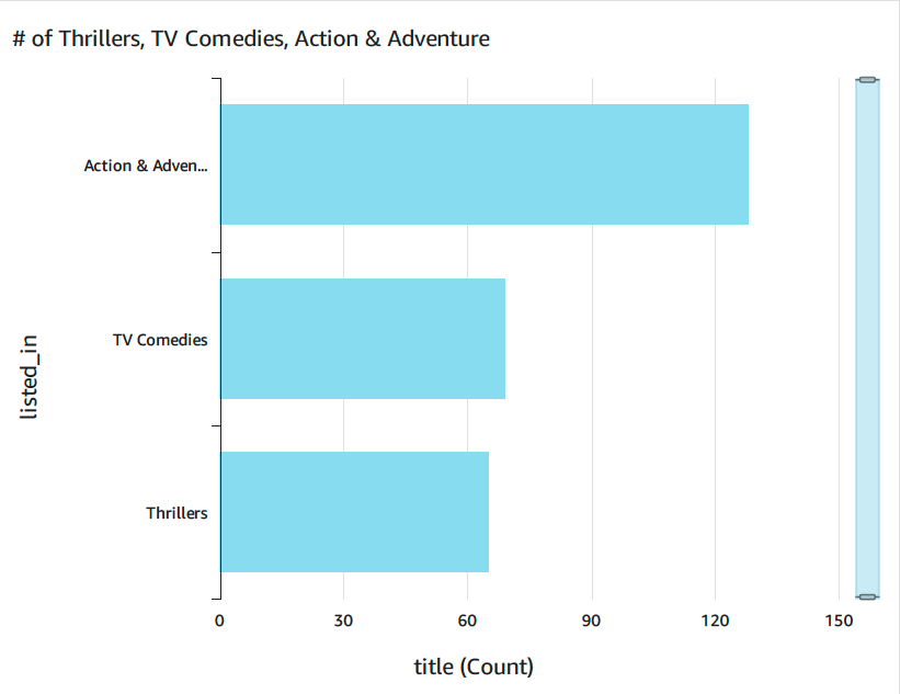
This visualization made it easy to see which genres dominated the Netflix catalog and how content priorities had shifted over time. The visual format transformed thousands of data points into an immediately understandable insight about content strategy.
Step 5: Implementing Interactive Elements
To make the dashboard truly useful, I added interactive elements:
- Created a date range filter (2011-2021) that applied to all visualizations
- Added a category selector to filter content by genre
- Implemented cross-filtering between visualizations (clicking on a bar in one chart filters data in others)
- Added parameter controls to allow custom threshold adjustments
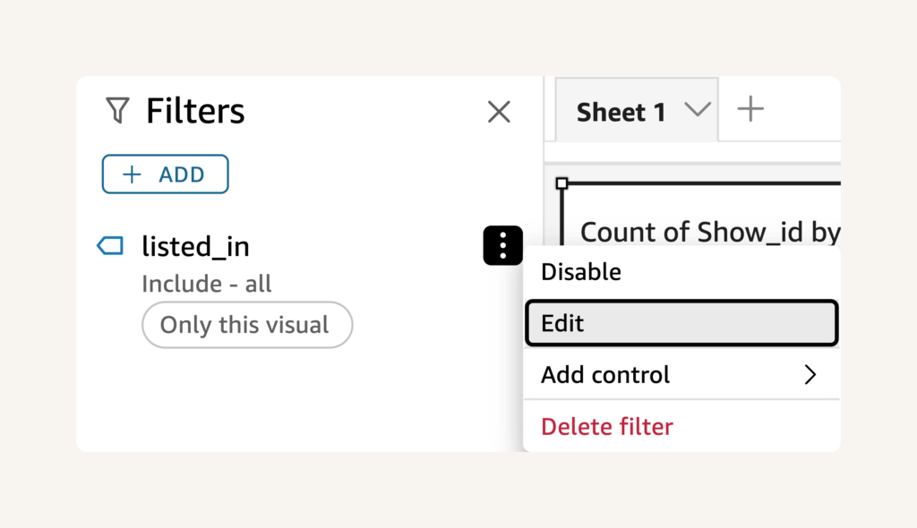
These interactive elements transform static charts into dynamic analysis tools that users can manipulate to explore different aspects of the data.
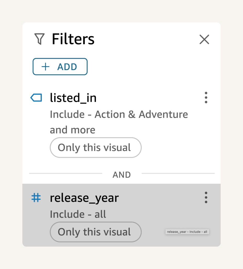
The power of modern BI tools like QuickSight lies in these interactive capabilities, which allow users to answer their own questions rather than relying on pre-defined static reports.
Step 6: Addressing Data Quality Issues
During analysis, I discovered quality issues with the initial dataset—specifically, missing country information for many titles. To resolve this:
- Downloaded a more complete dataset with better country coverage
- Updated the S3 bucket with the new dataset
- Modified the manifest.json file to point to the updated file
- Performed a full refresh of the dataset in QuickSight
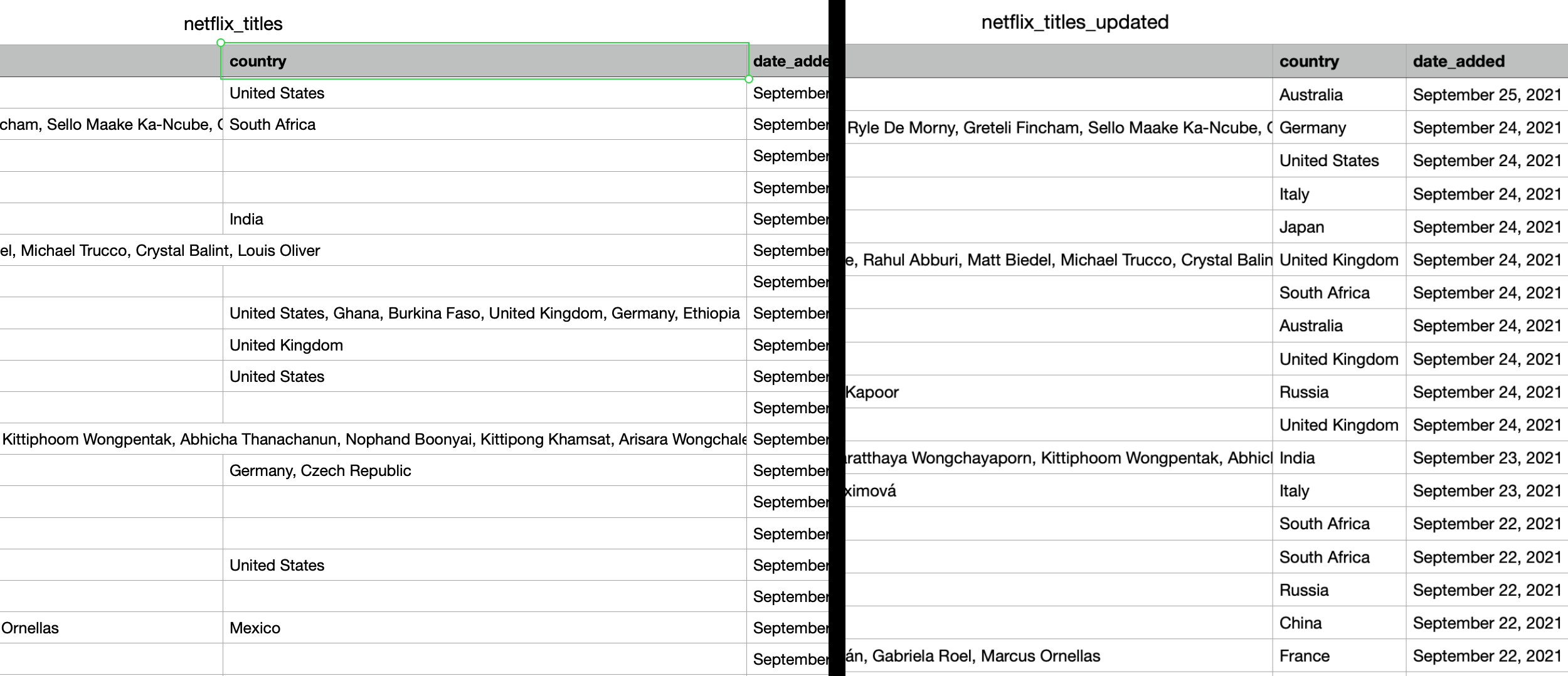
This experience emphasized the importance of data quality in visualization projects. Missing or incorrect information can lead to false conclusions, making data validation a critical part of the process.
Step 7: Publishing and Sharing the Dashboard
After refining my visualizations, I published the dashboard:
- Selected “Publish dashboard” from the top menu
- Chose “Create new dashboard”
- Named it “Netflix Content Analysis”
- Set appropriate sharing permissions
- Published the final version
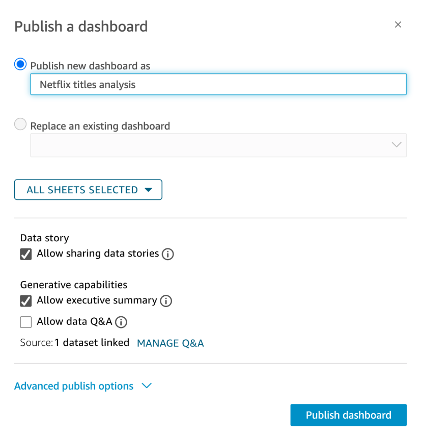
QuickSight provides several options for sharing dashboards, including direct dashboard links, embedding in web applications, or scheduling email reports with snapshot images. This flexibility makes it ideal for team collaborations or presenting findings to stakeholders.
Business Applications of This Approach
The techniques demonstrated in this project can be applied to various business scenarios:
Marketing Analytics
- Track campaign performance over time
- Analyze customer segment behaviors
- Visualize conversion funnels
- Monitor social media engagement
Operations Monitoring
- Track resource utilization
- Identify process bottlenecks
- Monitor SLA compliance
- Analyze inventory movements
Financial Analysis
- Track revenue and cost trends
- Analyze budget variances
- Monitor cash flow patterns
- Create forecasting visualizations
Challenges and Solutions
Challenge 1: Understanding Manifest Files
The most difficult aspect was understanding how the manifest.json file works and how it interacts with QuickSight.
Solution: I researched the manifest file structure in AWS documentation and experimented with different configurations until I understood the correct syntax for defining data sources.
Challenge 2: Data Quality Issues
The initial dataset contained incomplete information, particularly missing country data, which affected analysis quality.
Solution: I obtained a more complete dataset, uploaded it to S3, updated the manifest file to point to the new data, and performed a full refresh in QuickSight.
Key Takeaways and Best Practices
- Data Preparation Is Critical: Ensure your data is clean and properly formatted before analysis to avoid incorrect insights.
- Understand Your Data Structure: Take time to understand your dataset’s fields and relationships before creating visualizations.
- Interactive Elements Enhance Usability: Filters and parameters make dashboards more valuable for end users and analysts.
- Regular Data Refreshes Are Essential: Implement a process to keep your visualizations updated with the latest data.
- Start Simple, Then Expand: Begin with basic visualizations and gradually add complexity as you understand the data better.
Cost Management Tip: When experimenting with QuickSight, be aware of the pricing model. While the 30-day trial is free, continued usage incurs charges based on users and SPICE capacity. Always clean up resources when you’re done testing.
What’s Next?
This QuickSight project is part of my ongoing journey to build expertise in AWS services. I plan to expand my data visualization knowledge by:
- Connecting QuickSight to real-time data sources
- Creating forecasting visualizations using ML insights
- Building embedded analytics for web applications
- Exploring row-level security for multi-tenant dashboards
Each of these projects will build on the skills demonstrated here while focusing on different aspects of cloud data management and visualization.
Conclusion
Creating interactive dashboards with AWS QuickSight was an enlightening project that demonstrated the power of cloud-native business intelligence tools. The ability to quickly transform raw data into interactive, insightful visualizations showcases the value of modern cloud services for data analysis.
As a US Navy veteran transitioning into the tech industry, I found this project to be an excellent way to demonstrate cloud skills alongside data analysis capabilities. The project combines technical AWS knowledge with analytical thinking—a powerful combination for multiple career paths in tech.
Have you used QuickSight or other visualization tools for data analysis? What challenges did you encounter? Let me know in the comments below!
Interested in more AWS projects and tutorials? Subscribe to my blog for upcoming content on cloud services and infrastructure.


